Replay
Replay is that music app you didn’t know you needed — sleek, stylish, and ready to soundtrack your every moment. The brief? Craft a mobile interface that’s dead easy to use, but packed with personality. No fuss, no fluff — just a solid user experience with a bold visual edge.
Overview
Company
Self-initiated project
Role
Visual (UI) Designer
Year
2020
The Challenge
Design a Mobile Music Experience That Hits All the Right Notes
In a crowded field of music apps, the challenge wasn’t just to look good — it was to create something that feels alive. We needed a design that was modern, energetic, and effortless to use — a UI that keeps users in the groove from the moment they sign in to the instant they hit play.
The goal was to shape a clear, intuitive journey where every interaction feels natural, every screen stays consistent, and every visual choice reinforces the app’s youthful vibe. And beyond looks, it all had to be ready for seamless developer handoff — complete with a detailed style guide to keep everything on beat through build.
In short, this wasn’t just about designing a music app — it was about crafting an experience that moves with the same rhythm as the people who use it.
Competitors

Spotify
Deezer
Beats Music

Apple Music

SoundCloud

Amazon Music
APProach
Designing Replay wasn’t just about making something that looks good — it was about creating an experience that feels right from the very first tap.
Everything started with wireframes — sketching out ideas and building the structure that would hold the experience together. Before diving into colours, shadows, and motion, the focus was all on clarity: keeping the flow simple, intuitive, and effortless to navigate. Still, simplicity didn’t mean plain. Since Replay’s brand would carry a modern, fashion-forward attitude, each layout was designed to feel clean but full of personality — minimal, yet confident.
Once the foundation was solid, I moved on to mid-fidelity prototypes to bring motion and rhythm into play. This stage was about testing user flows, especially during onboarding, to make sure every transition felt natural and every step made sense. It was the perfect time to spot rough edges, gather early feedback, and fine-tune the experience until everything clicked seamlessly.
Brand
Design without a style guide? Absolute chaos. So to keep Replay looking crisp, cool, and consistent across every screen, I built a solid visual foundation — and made it sing.
The visual direction was born before the high-fidelity phase even began. The goal was to define a brand that could translate perfectly into pixels — bold enough to stand out, but smooth enough to feel effortless. The app runs fully in dark mode (because let’s be honest, everything looks cooler in the dark), with rich purple accents adding just the right pop of energy. The colour palette was carefully chosen to feel modern and a little rebellious — just like the music it was made for.
Primary Palette
Dark Purple
Hex: #26232F
Black Background
Hex: #15141C
Purple
Hex: #6A04AB
Accent Purple
Hex: #9A04FB
Secondary Palette
Accent Navy
Hex: #3907FF
White
Hex: #FFFFFF
Grey
Hex: #E5E5E5
Dark Grey
Hex: #67636B
Typography and Iconography
For typography, I went with Open Sans — clean, legible, and friendly. It keeps the interface feeling open and approachable, even when you’re deep in your playlists at 2AM.
Spacing, iconography, and UI elements were all designed with rhythm and consistency in mind, keeping the experience cohesive and making the developer handoff as smooth as a slow jam.

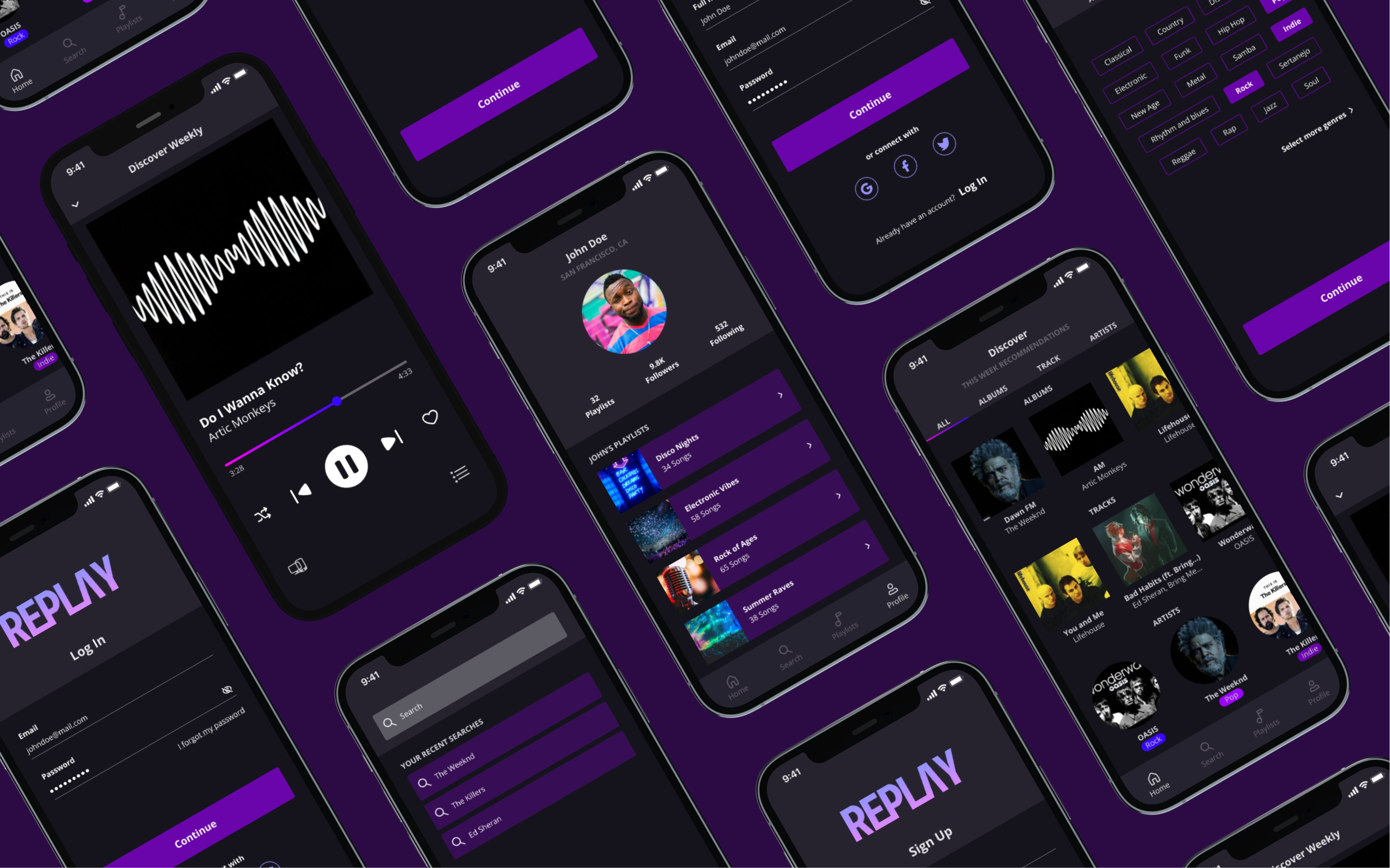
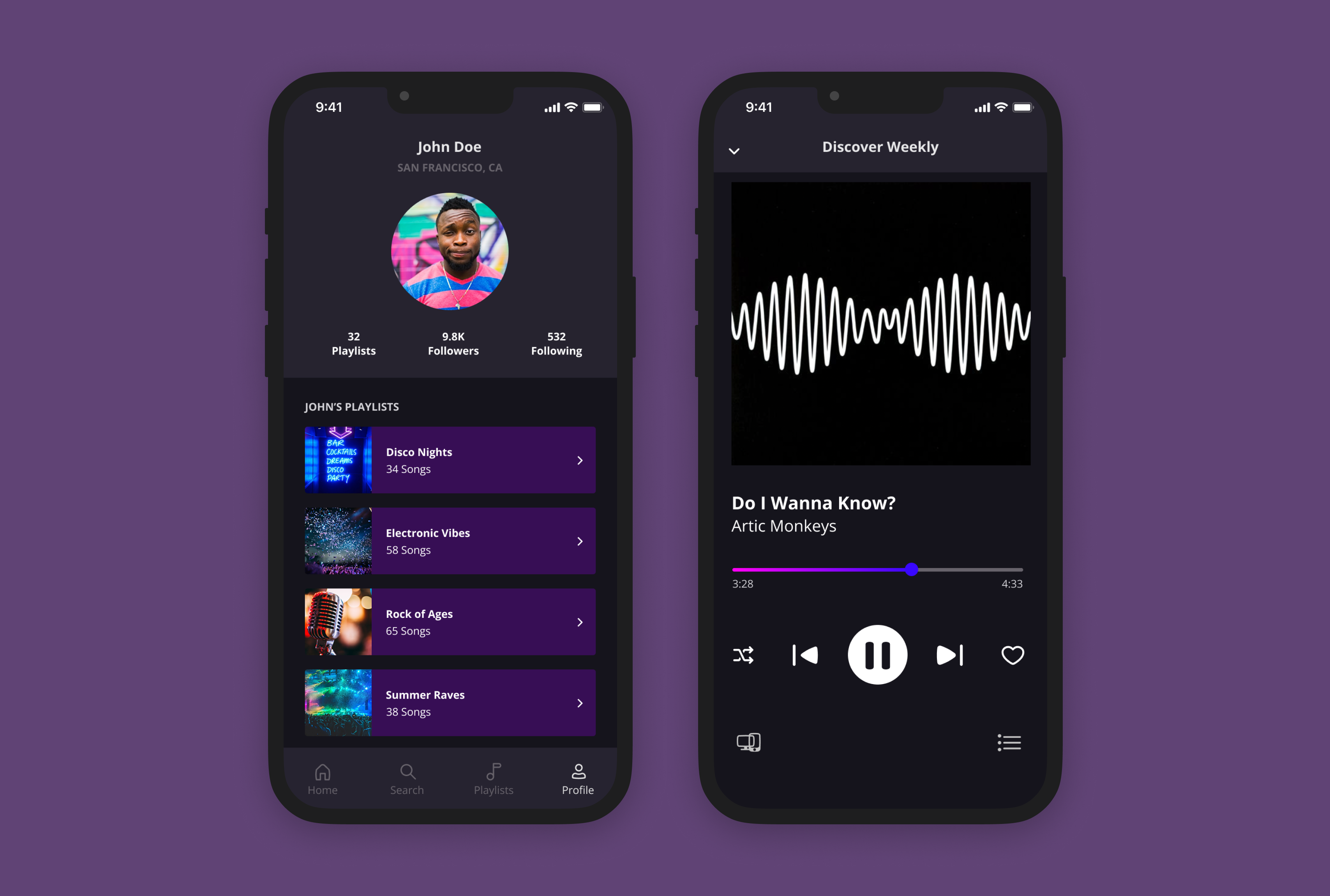
The Execution
Once the foundations were set, the high-fidelity designs brought everything to life.
Dark mode tones, vibrant purples, smooth typography, and subtle micro-interactions worked together to create a cohesive, expressive look and feel. Each screen wasn’t just made to look good, but to move beautifully — making Replay feel polished, intentional, and in perfect sync with the energy of its users.
Because good design isn’t just about visuals — it’s about keeping the rhythm across every tap, scroll, and swipe.
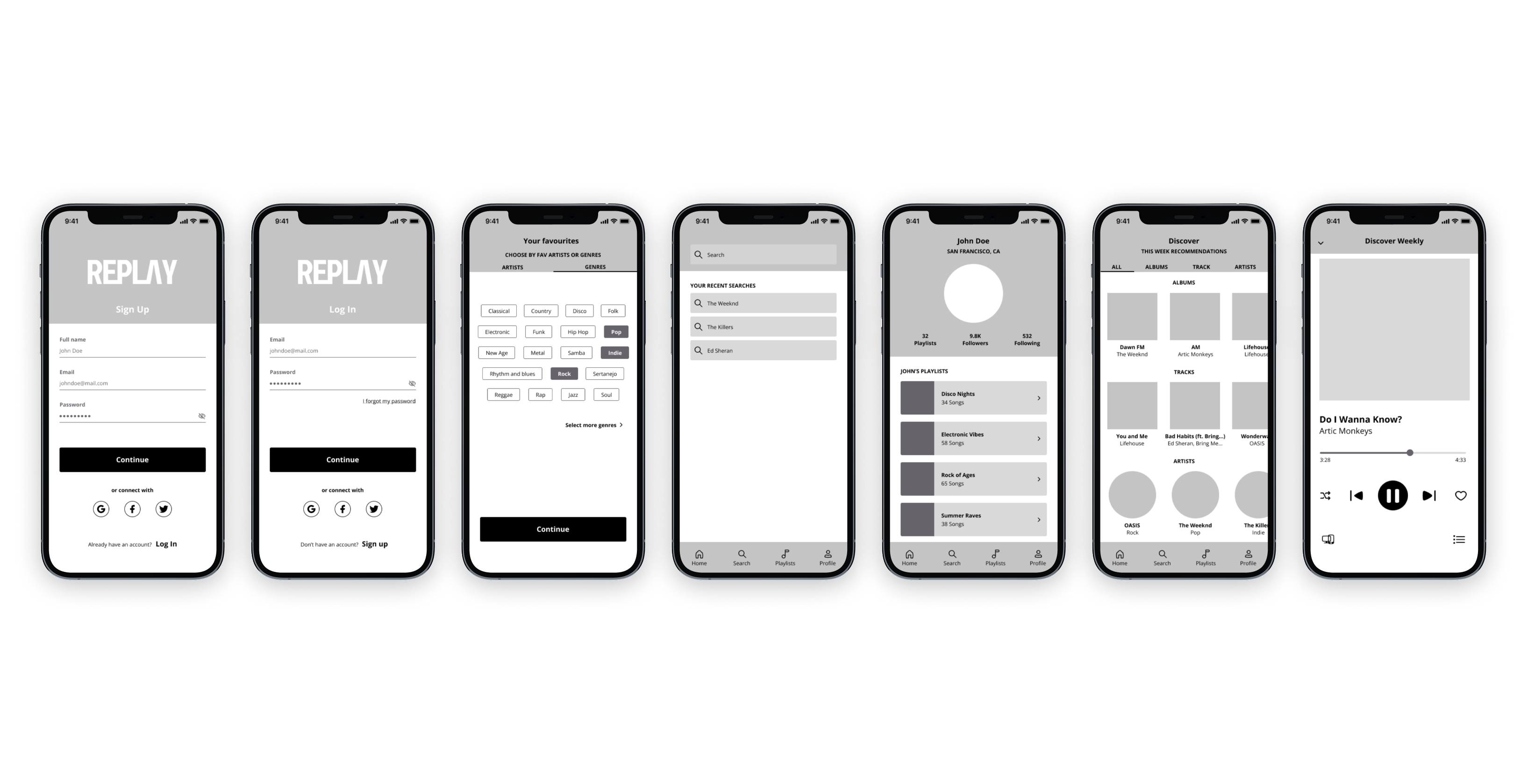
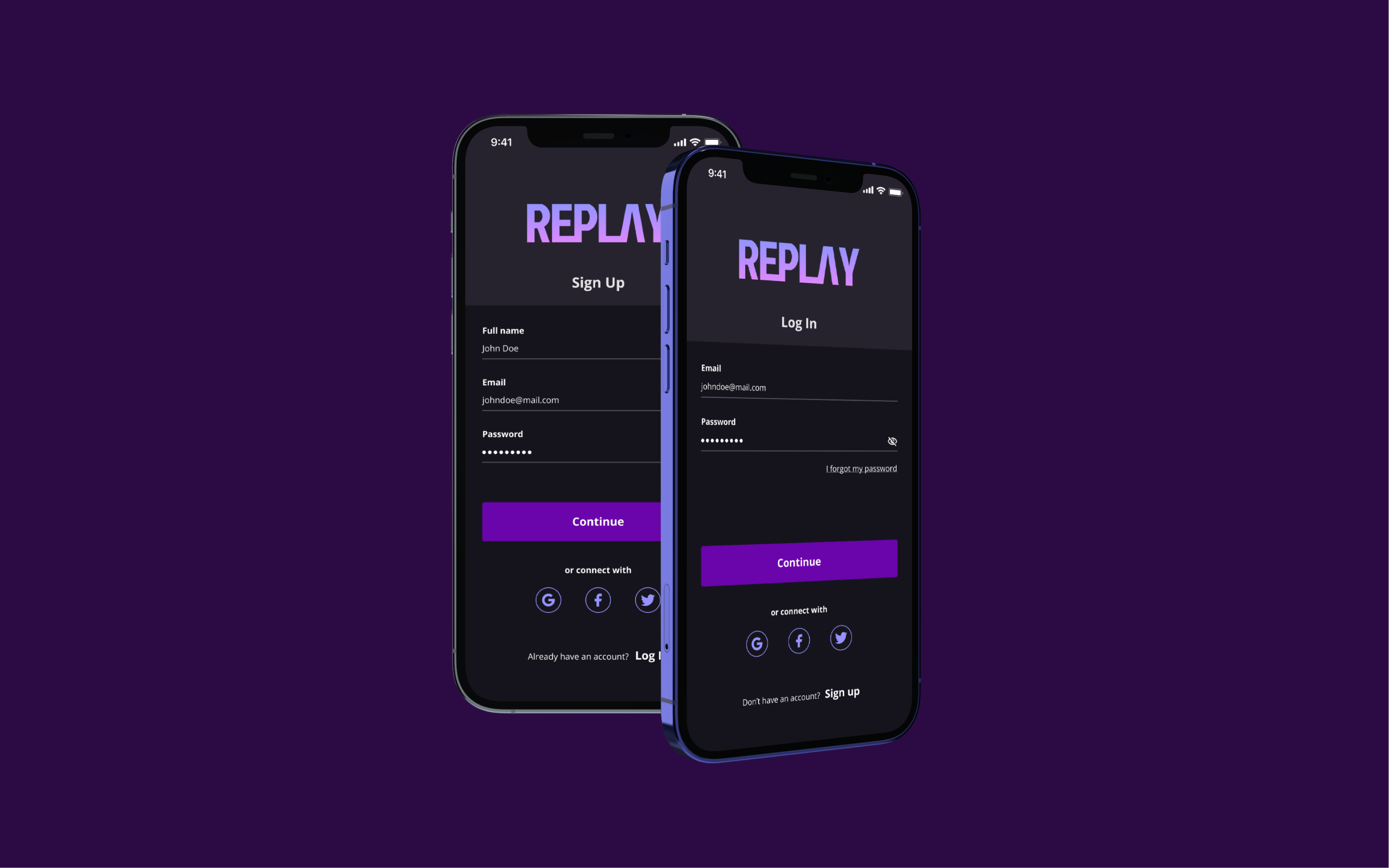
Get Started!
Jump straight into the music. Users can create a new account or log in with an existing one, with quick options for Facebook, Twitter, or Google sign-in. Getting started has never been this easy.
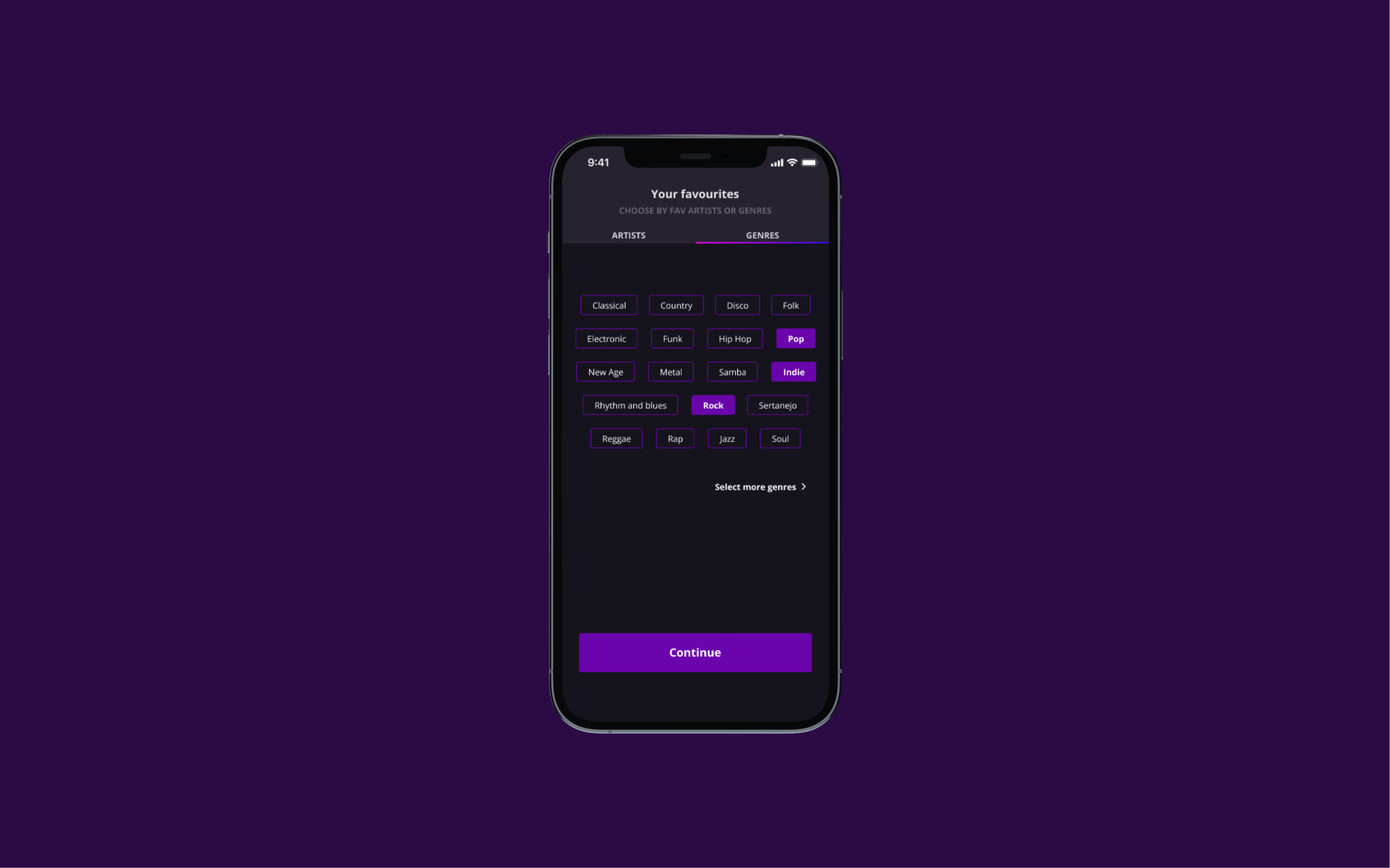
Your Vibe
Make it all about you. Users can shape their music suggestion feed by selecting favorite genres and artists, ensuring their playlists are always filled with tracks they actually love.
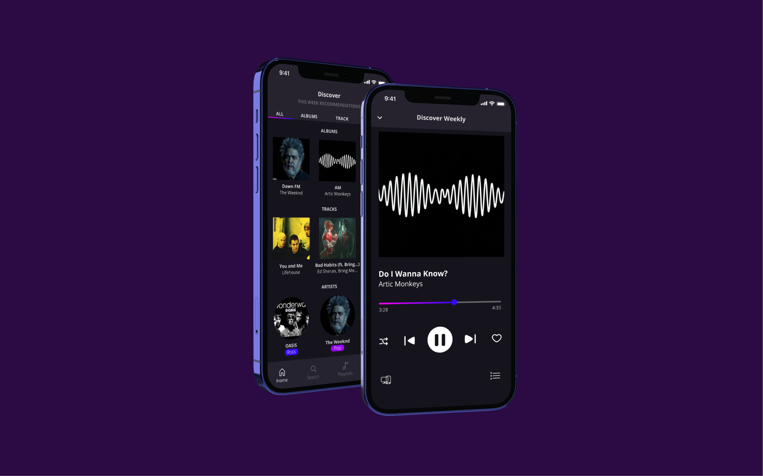
All your Faves!
All your favourites, all in one place. Get personalized recommendations based on what you love, create custom playlists, and share your musical vibe with friends.
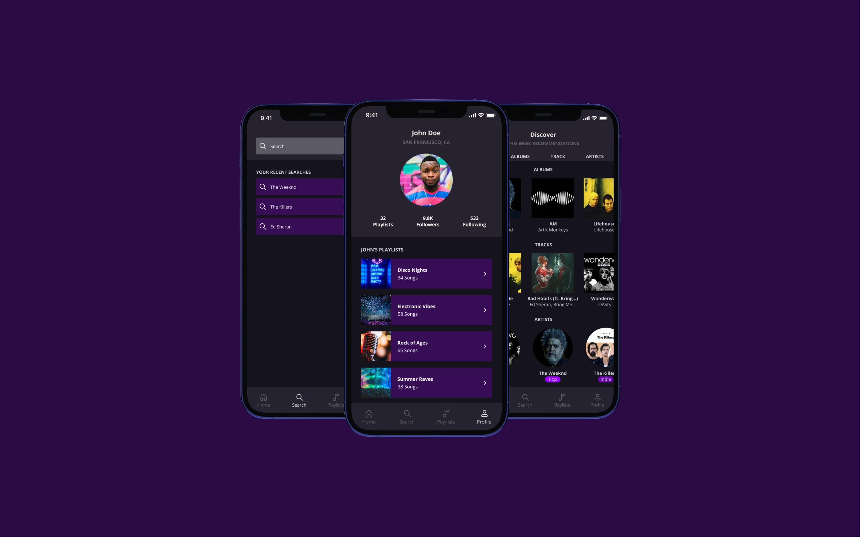
Rock Out!
All your favourites, all in one place. Get personalized recommendations based on what you love, create custom playlists, and share your musical vibe with friends.
Takeaways
Designing Replay was more than just putting together pretty screens — it was about crafting a bold, modern music experience that feels effortless to use.
From defining the brand identity to polishing every pixel of the UI, this project pushed me to balance simplicity with personality, usability with visual flair. It was a true exercise in designing with intention — making sure every interaction, screen, and scroll hits the right note. 🎵
Whether you're discovering new tracks or jamming to your all-time faves, Replay is designed to make every tap feel like part of the beat.