
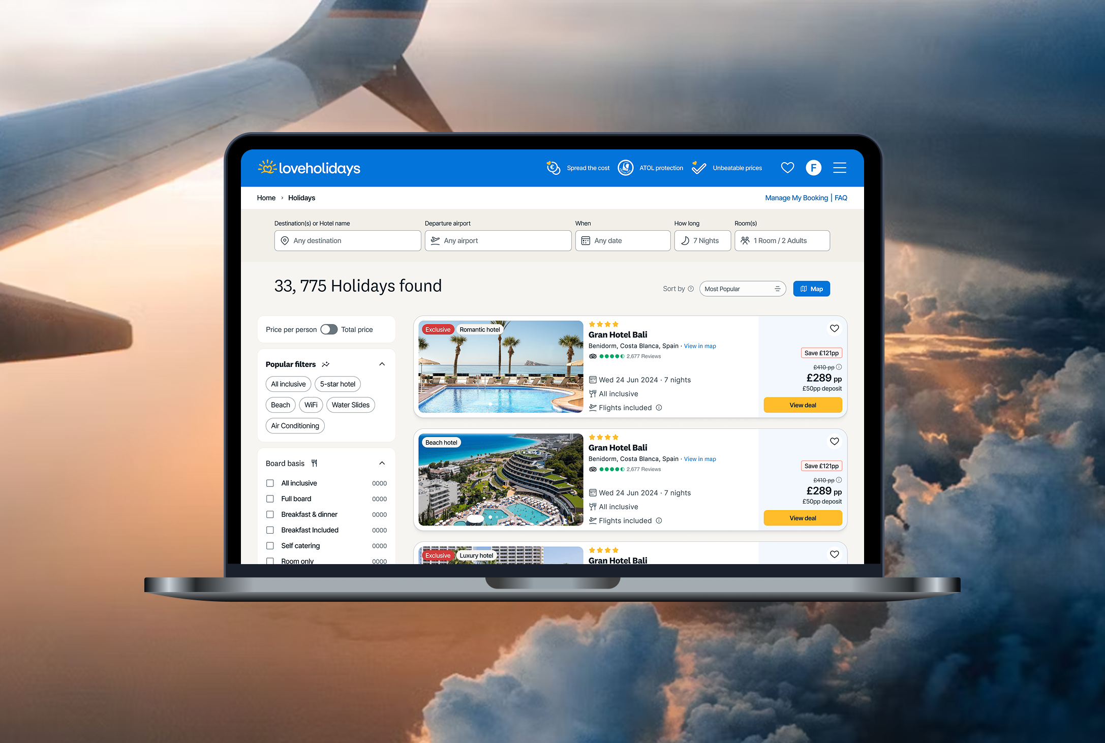
Hotel cards
In a context of ever-growing promotional campaigns and marketing messages, our hotel/package cards began to hold more information than there was space for. As a Product Designer at an online travel agency, I noticed that the card — which should help users quickly choose a hotel — was becoming visually cluttered and confusing. This project was born from the need to rethink that experience: how could we reorganise the content in a way that felt clear, helpful, and visually balanced?
Overview
Company
loveholidays.com
Role
Product Designer
Year
2023
The Challenge
Over time, our hotel cards had turned into a mini chaos. Every new campaign, every marketing request, every “just one more tag, please” made the design a bit more crowded.
What was supposed to help users choose faster ended up doing the opposite — too many messages, no clear hierarchy, and zero breathing space.
As a Product Designer, I knew something had to change. So the challenge became:
How could we bring clarity back to the card — without losing all the important info that business teams loved?

My goal was to rethink the card from the ground up: understand what really mattered to users, clean up the noise, and create a version that was clear, scalable, and ready to grow with us.
The Process
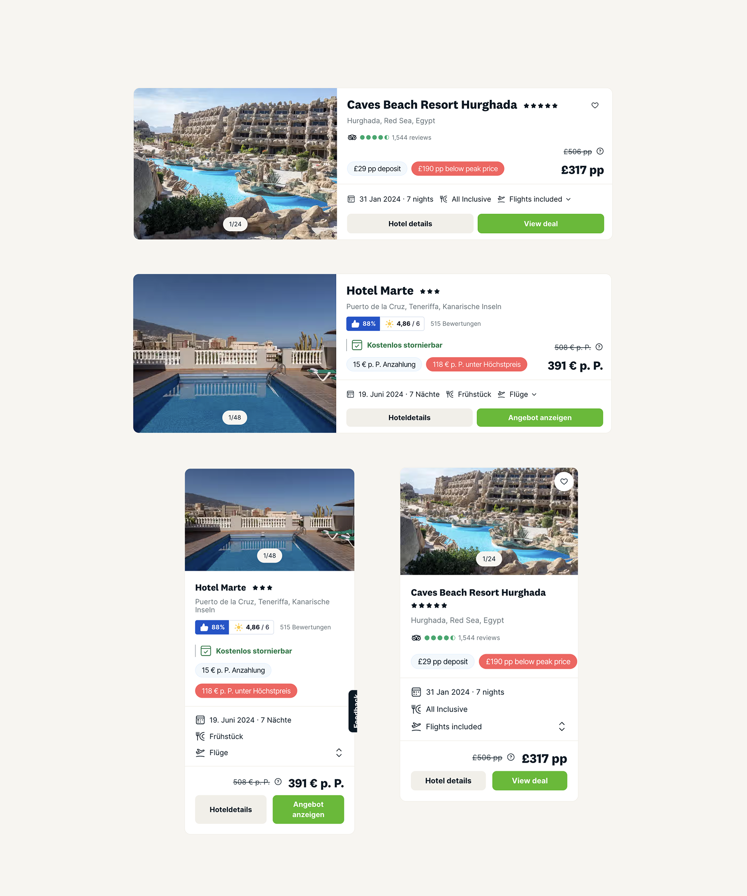
It all started with a messy card...
Every time I opened the search results page, my designer brain screamed a little. Colours everywhere, overlapping tags, inconsistent icons — it was chaos disguised as a product feature.
If we couldn’t read it easily, imagine what users were going through.
So I raised my hand and said:
“What if we just rethink this card from scratch?”
Cue dramatic music. 🎬
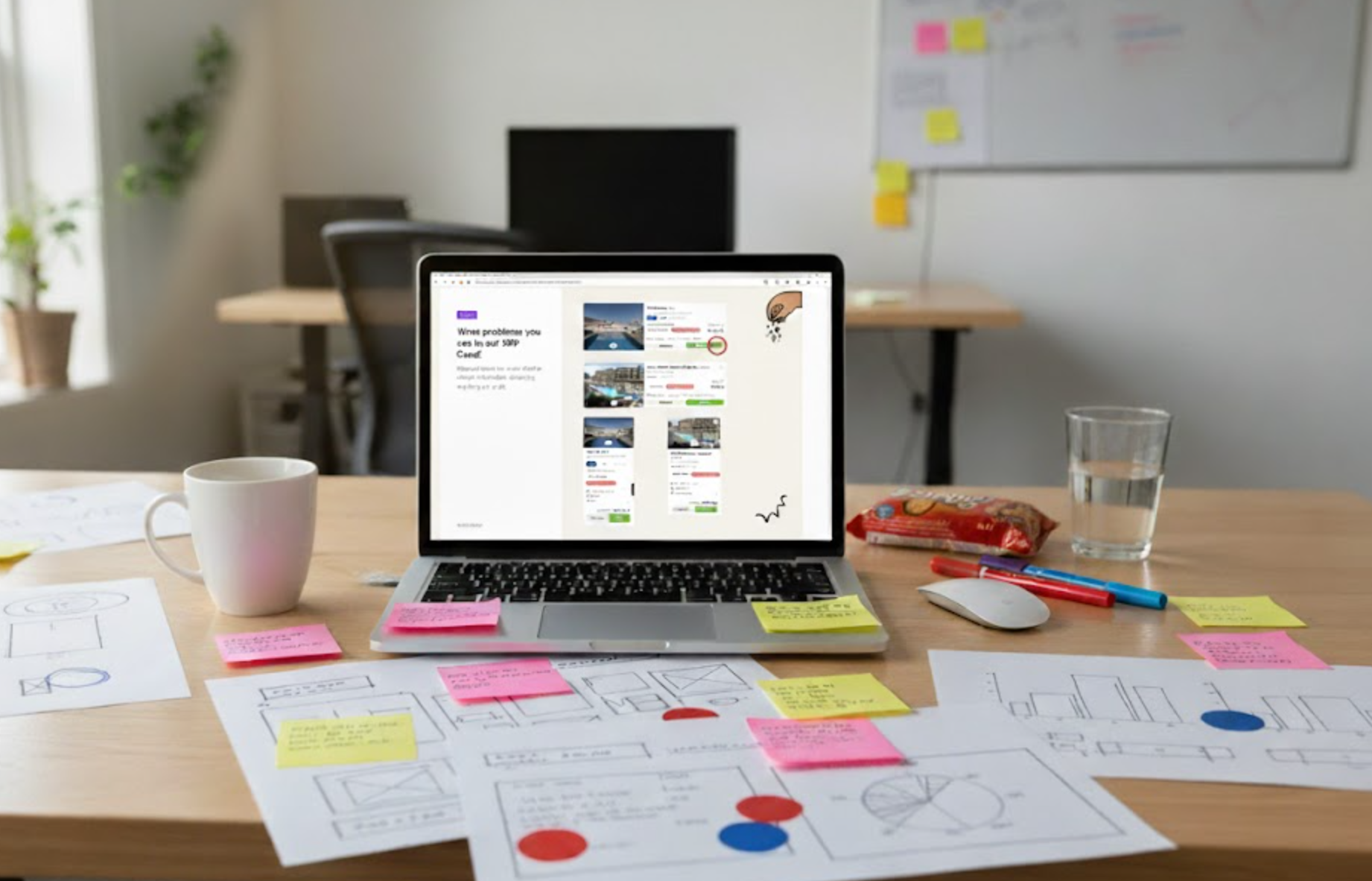
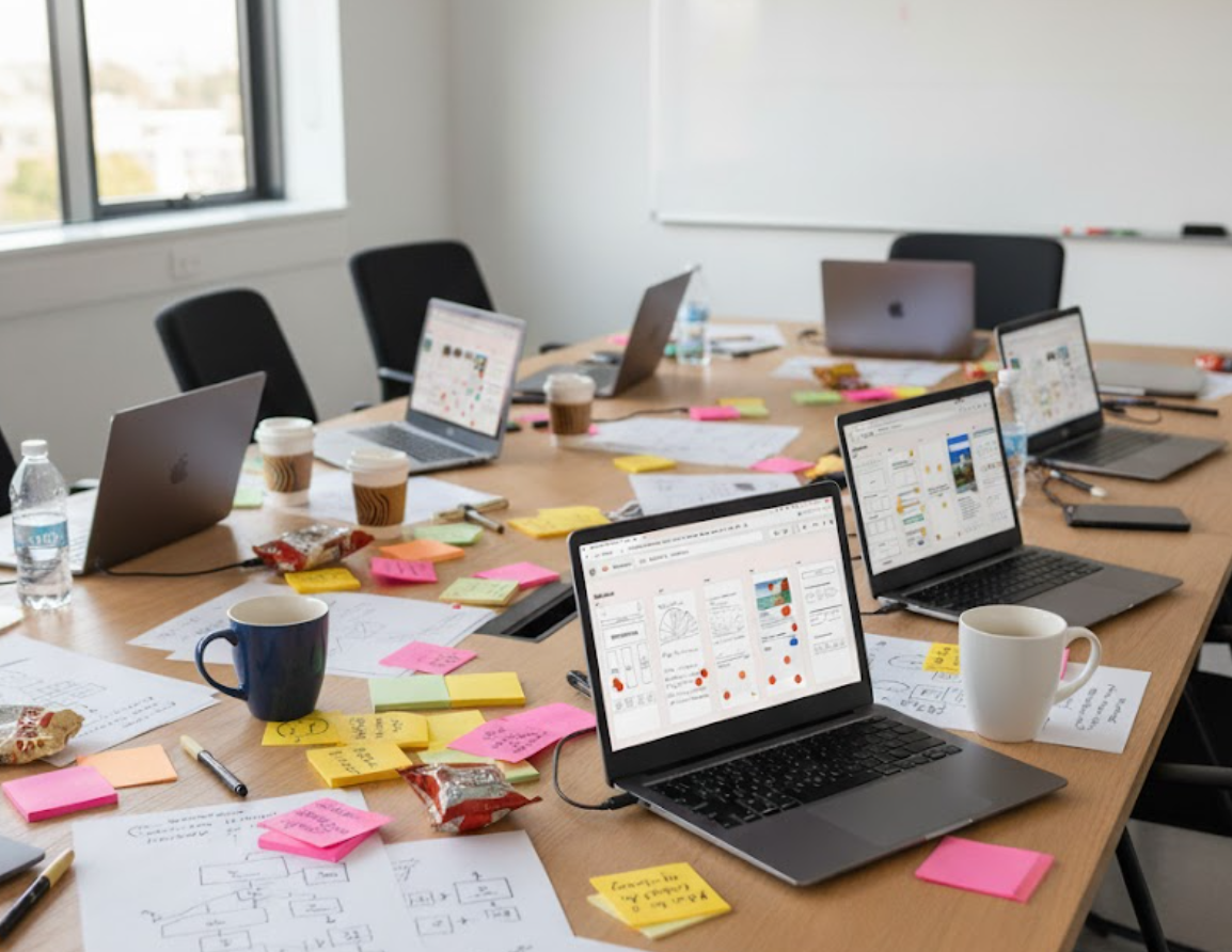
The Workshop That Changed Everything
I gathered everyone who had a stake in it — engineers, PMs, other designers, and marketing folks. No screens, no Figma yet. Just one question:
“What’s the real purpose of our hotel card?”
Turns out, everyone had a different answer. And that explained a lot. The card was trying to be everything at once — marketing banner, information hub, and pricing hero — and ended up being none of them properly.
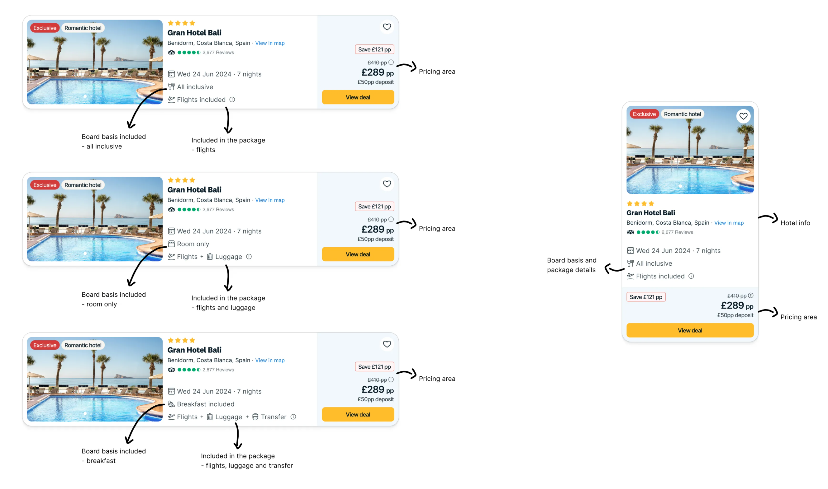
To ground the conversation, I shared results from a usability test I’d run earlier.
Users told us they loved seeing things like hotel type (“beach”, “romantic”, “luxury”), and found deposit info genuinely helpful. But they were also confused by random tags and didn’t always understand what they meant.
The problem wasn’t that we had too much — it’s that we weren’t showing the right things in the right way. We then took the card apart, literally. On a shared screen, we highlighted everything that didn’t make sense, felt repetitive, or looked chaotic.
We ended up identifying six big pain points:
Architecture:
The card’s structure had no clear logic. Different pieces of information were fighting for attention.
Size:
The card kept growing to fit new content requests. More tags, more badges, more text... until it just didn’t fit gracefully anymore. We had to rethink proportions and space so everything could breathe again.
Messaging and Copy:
Everyone wanted a message on the card — from marketing to product. But too many voices at once meant no single message stood out. The copy needed focus, tone, and purpose.
Pricing:
The most critical piece of information — the price — was getting lost in the noise. We couldn’t easily understand what was included or what the total meant.
Content and Functionality:
Some elements looked clickable but weren’t. Others were interactive but didn’t look like it. We had mixed signals everywhere. Clarifying what was content versus what was action was key.
Badges and Tags:
Badges had multiplied like wildflowers — pretty, but chaotic. There was no system or priority. We needed a cleaner, consistent tagging logic.
And then... Boom. Instant clarity.
From Chaos to Structure
Next, we brainstormed. What would actually be useful to show on the card?
The ideas were flowing — and engineers kept us honest by listing technical constraints. I grouped everything into five core themes (which looked suspiciously like our problem list — poetic, right?).
By the end of the workshop, we had a treasure map: real insights, solid ideas, and shared excitement to fix this once and for all.
Design
Data, Competitors, and Some Sketchy Thinking
Before jumping into pixels, I did my homework.I looked at how other travel sites structured their cards and analysed our own data — how users interacted, what they clicked, and where they dropped off.
Across the industry, I noticed a pattern:Cards had a clear, logical flow — hotel info first, extras next, pricing after, and functionality last.
Simple, familiar, effective.
So I grabbed a pen (okay, a tablet) and started sketching what a sane version of our card could look like.
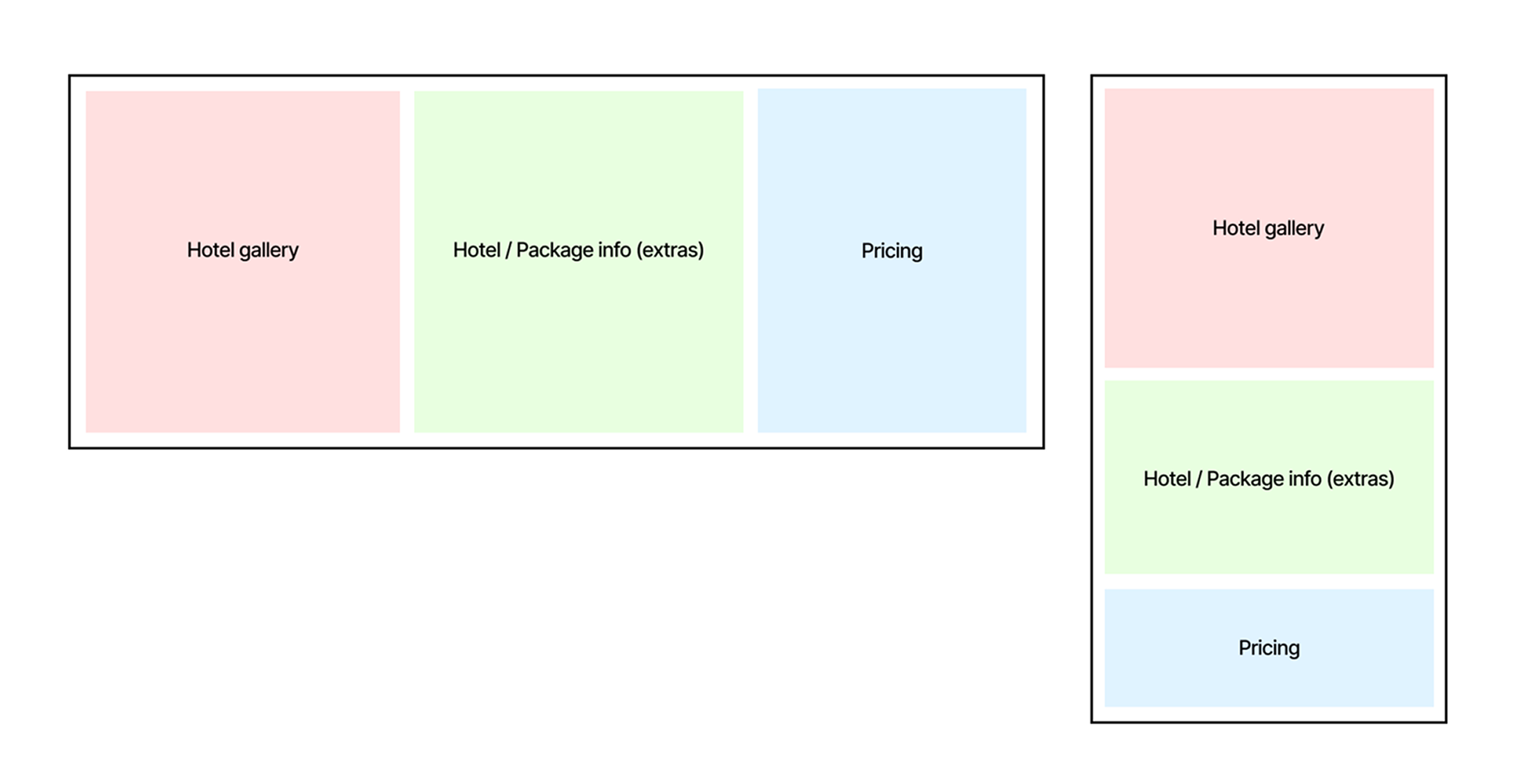
An information blueprint, grouping content based on user priorities and visual hierarchy. It was like giving our card a proper skeleton before dressing it up.
Current information grouping in our cards:
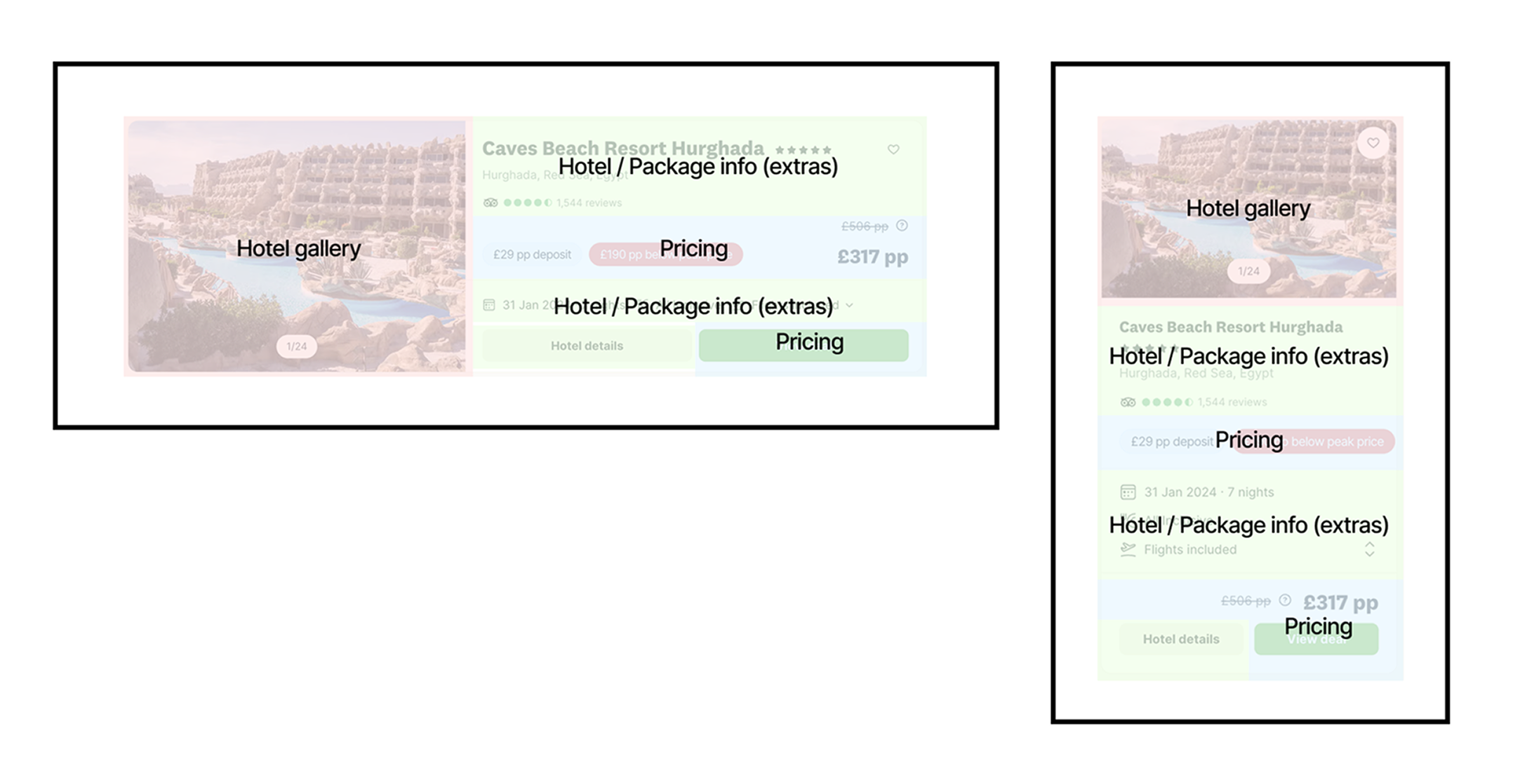
Proposed grouping hierarchy:
Design Exploration & Testing
I mocked up several layout variations, shared them with the design team, and tested them with real users. Some concepts landed instantly, others flopped spectacularly — but that’s the fun part.
Through iteration, the card started to breathe again.Cleaner, clearer, easier to scan. Each piece of information had its place and purpose.
We made tough calls (some things just had to go), but in the end, we landed on a version that felt balanced, intuitive, and — dare I say — delightful.
Impact
For users:
- Improved visual clarity and information hierarchy.
- Reduced confusion around the meaning of tags and badges.
- Highlighted key attributes (e.g. hotel type and deposit-based payment).
- Faster and more intuitive comparison experience.
For businesses:
- Reduced overload of non-prioritised messaging on cards.
- More sustainable framework for scaling future campaigns or services.
- Uplift in conversion through clearer, more readable cards.
For enginneers / platform:
- Modular structure that is easier to maintain and extend.
- Early alignment with technical constraints helped avoid rework.
- Design built with performance and scalability in mind.
- Solid foundation for future iterations.
Learnings
Facilitating that workshop was a turning point. It wasn’t just about redesigning a component — it was about realigning teams and purpose.
When everyone feels heard, the solution naturally becomes stronger.
It also reminded me that users don’t just compare hotels — they compare experiences. If something feels familiar, structured, and trustworthy, they move faster and decide with confidence.
And finally: test early, test often.
Some of my “brilliant” ideas didn’t survive testing — and that’s exactly how it should be. Each iteration made the design lighter, more focused, and ultimately more human.
